changes in the final project
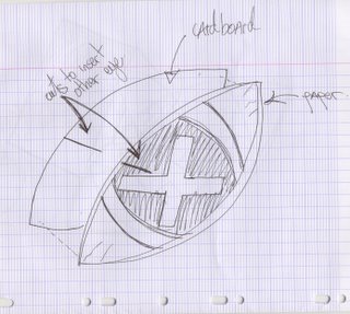
Hello, today is the final exhibition and I realized I completely changed the layout of my work as I started doing it.....It is now a piece with 5 eyes, eah eye has a symbol in the middle to explain a particularity of my interface....
The multiplication sign signifies its ability to be used by many users at the same time.
The health sign is because the glasses actually care about your eye sight and adapts the image distance according to your position from the screen.
The recycle sign is to indicate that the glasses can be used on any tv, at any random location; and since your own vision glasses can be adapted to the tv, you dont have to create a new pair.
The hammer and wrench means that the glasses are customizable, you can make them your own by changing the color and the look.
The sharp sign (#) is a play on words, it symbolizes the sharpeness of the image of my new tv.
I actually hate TVs....I dont understant how I got carried away in this project. I never watch TV and therefore wanted to give this gory look on my final piece by adding a lot of red....Since I focused on the eyeball rather than the eye, I thought that I would make this little strings attached to the eyeball that would kind of look like nervs..... So this throws off the color study I had in mind and directs it to a red dominant field....
Here is a picture of the finished piece.

